Equities are very cheap. Real risk free rates are exceptionally negative. The real-terms risk premium is higher than at typical bear market lows. That’s what a pandemic can do at a time when risk free rates are still represssed by the monetary response to the credit crisis 10 years ago.
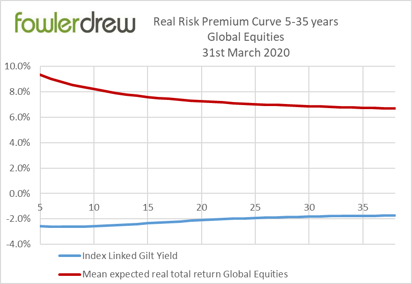
The chart shows the risk premium for the Fowler Drew optimised risky (return-seeking) portfolio funding liabilities at every horizon from 5 to 35 years, as the gap between the mean equity return and the real risk free rate based on index linked gilts with the same duration as the liability. In a Fowler Drew goal-based portfolio, managed to deliver horizon-specific outcomes within agreed tolerances, the optimal portfolio combines a risky and risky allocation, adopting a technique of ‘portfolio separation’ well-suited to asset/liability modelling. The risk approach is derived from responses to information in the form of probability distributions for outcomes (I must be able to spend at least £x but I value £y) and the range of outcomes is controlled via the dynamic mix of risky versus risk free exposures. A goal-based portfolio with multiple horizons (such as retirement spending) has a dedicated mini-portfolio for each year, with its own resource requirement and asset allocation. The total portfolio is the sum of all the mini-portfolios. Clearly a job for computers.
The expected returns for individual equity markets and regions are derived from regressions of each market’s own real total return history. The correlation estimates are also derived from history. The profile of the curve for the optimal combination of them reflects a time-dependent mean reversion effect. There is no fundamental input and no exercise of judgement: this is a systematic process for generating returns, constructing portfolios and rebalancing with each new model run.
The data in the chart is the product of end March model runs. The red line is the mean expected real total return of the Fowler Drew risky asset portfolio at each horizon from 5 to 38 years. The downward slope reflects the weak mean reversion effect (also derived from history), most of which is assumed to have arisen by about 17 years. The steepest point of the curve is also associated with the greatest risk so in an overall portfolio there is unlikely to be an equity allocation for horizons as short as 5 years but less risk-averse clients may normally have equity exposure for liabilities 10 years or more out.
The blue line is the Index Linked gilt yield curve, to give us the horizon-matched risk free rate. What is exceptional is the level of real risk free rates. These have moved to greater negative yields as a response to the coronavirus flight to safety. Compared, therefore, with normal allocations for any given risk approach and horizon, Fowler Drew equity allocations are now higher, as a systematic, objective reaction to the coronavirus risk premium.
The equity opportunity set is uniformly above bear market extremes in terms of its deviation from its own regression trends. There is no reason to believe it will test such extremes: that would be supremely over-confident. But allocations can reflect where we are today.
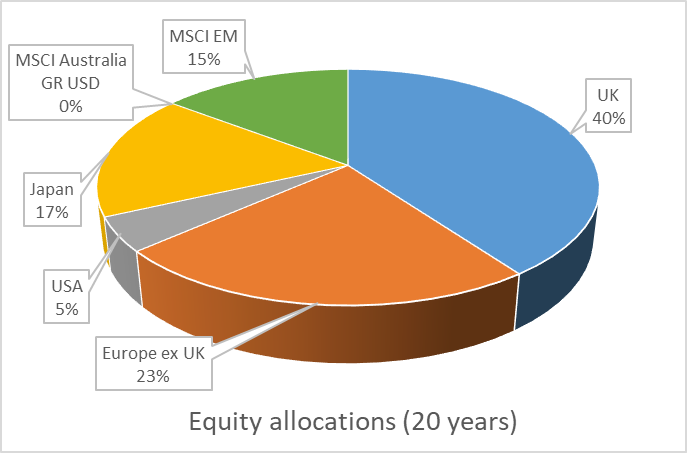
In the case of the S&P500, it is nearer its trend than past lows relative to trend but that is not the case in other markets particularly. In the pie chart showing current allocations for a 20-year horizon, the US is well below our earlier allocations having been the powerhouse of our recent returns. Japan and Emerging Markets are well above ‘normal weights’ (given by risk differences, where all are in line with their trend) and the UK, which has no model-driven home bias, is also somewhat above normal. That partly reflects the fact that Sterling is below a ‘naive’ estimate of its Purchasing Power Parity with the dollar, euro and yen (derived from historical inflation-adjusted exchange rates).
In an earlier article, we suggested the political reaction to the pandemic is very similar in effect to the policy response to the banking crisis. However, we should be aware that while some aspects of ‘sound balance’ had been achieved this is not at all the case for central bank balance sheets which entered the current crisis at close to peak levels. These may now double or more in just a few months of government intervention to make good lost wages (but not lost output).
Reading this, it may not have escaped you that this is a compelling reason for individuals to seek increased utility by exchanging Defined Benefit pension rights for a greater level of equity exposure where the scheme has already reduced its equity allocations under accounting and regulatory pressure. If a scheme now largely holds a portfolio with discount rates close to the index linked gilt yield curve in the chart, it is obliged to offer cash equivalent transfer values that are easily beaten by equities, even with a modest exposure. Though the chart only shows the mean expected real equity return, there is a positive risk premium at 95% confidence from about 6 years out and very little risk of shortfall even at 99% confidence. This now (just) exceeds previous peak ‘transfer utility’.
Which brings us to the $64,000 question: are these probability distributions realistic? Well, the time-dependent risk numbers are drawn from histories that include periods of extreme stress that many might not have expected the market system to recover from. But it did. The trends themselves are subject to change, even though they have proved fairly stable, considering the extent to which output and other measures of gross (not per-share) activity have changed, be it with stages of economic development or with economic cycles. We don’t think coronavirus threatens the assumptions in the return-generating model. This was also the subject of an earlier article. But our clients are of course among the most natural risk takers, or backers of the system, available in markets today. Many other liability-driven principals like life assurers, pension funds and banks have been driven out of equity risk taking, at any risk premium. Sovereign wealth funds have taken some of the slack but it is private client wealth that has always stood ready to make the trade offs implicit in the chart above. On behalf of our clients, we are.