- An equity index for a single market is ‘passive’ in name only, having Darwinian adaptive dynamics
- It doesn’t represent all of a country’s company sector or economy
- But it is apparently itself a ‘system’: mean reverting slowly around fairly stable growth trends
- Combined with currency exposure, local and foreign indices are equivalent ‘real-return engines’
- Indices are an objective means of estimating, by extrapolation, future real return probabilities
- There is a lot you can do with this information that is valuable for investors
There have been several recent articles, such as by Miles Johnson in the FT and Paul Lewis of the BBC’s Money Box writing in Money Marketing, that have raised questions about one of the essential features of an equity index: its constituent companies and sectors change, or change weights, so much over time as to call into question the relevance of the past. This suggests that one of the key things about indices we take for granted at Fowler Drew is not so obvious to others.
The usefulness of an index arises from it being, by virtue of its construction rules, a true representation of the underlying adaptive dynamics of public companies over time, dynamics that record the outcomes of battles won or lost by technological edge or determined by management competence or just plain luck. It is not important that it be representative of the whole of the company sector of a country or that it reflect the entire economy, which is a mix of listed and unlisted, state and private, domestic and global. Nor is it important that it be well-balanced between sectors or industries or not dominated by a few very large firms. These may all have a virtue but they conflict with our test of usefulness. This is that it represents the actual market opportunity set, warts and all, that investors were contemporaneously behaving in relation to, and behaving in ways that could explain and validate the observed ‘systematic’ attributes of a time series of index returns that make that history predictive of the future. This is not an indulgence about understanding the past better. This is about understanding the present and its implications for the future. It may not be predictive of the near future but there is a lot that can be done with medium and long-term predictions that investors should prize.
With the benefit of this insight it is easy to see index-tracking as an alternative approach to active management at the stock selection level. It is a rules-based, agnostic and unemotional method of actively managing the constituents of an equity portfolio, where other active approaches are likely to be judgemental, subjective and emotion-prone. Both are Darwinian, in the sense of trying to capture the returns associated with the survival of the fittest. The index will tend to be lagged (reacting to the observed changing fortunes of companies and sectors) whereas the active approach is more predictive (believing the advantage lies in the prediction of those changing fortunes). Whether one is superior to the other is partly about costs but mainly about those prediction skills.
With the benefit of this insight, the choice between active and passive is not as great as is typically made out. For many index adopters it has been a quite practical cost/benefit trade off rather than a manifestation of a radically-different belief system. And it has often followed from the realisation that, as owners (or fiduciaries) of capital, they were previously making arrangements with agents managing the money that effectively condemned them to index-like returns without the cost savings of an index-tracking approach. Examples are hiring an active manager who does not like to deviate much from the index; or hiring a group of differentiated managers whose combined portfolios may closely follow the index even if no single one does. Moreover, the change in strategy once adopted has often meant that the cost budget was reallocated to decisions that will explain outcomes more than security selection, such as an asset allocation approach that better addresses both outcome objectives and risk controls. It may be no coincidence, for instance, that the growth in index tracking has moved in parallel with the growth of liability driven investing.
You could stop here but in the rest of this article I add some detail to the argument, in case the detail is what switches the light bulb on. Starting with the idea of a Darwinian process.
Darwin and the markets
I wrote recently about the coming technology disruption and its implications for index-tracking investors. I made the point that technology disruption is an important feature of the long histories of the returns from the opportunity set investors were at the times faced with. I took the US equity market as an example. I show here the same index of cumulative real (after inflation) total returns (capital gains plus reinvested dividends) in log terms (keeping all changes proportional).
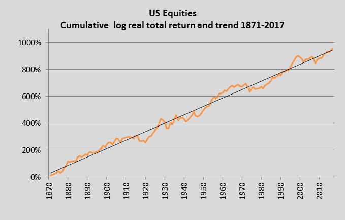
Most of this index is the contemporaneously-published S&P Composite. The total return data prior to 1926 addsbackfilled dividend data topublished price data. Clearly, the period from 1871 includes some major changes in America’s own state of economic development and relative power as well as changes in global trends, of which technology is one of the most important. Not surprisingly therefore the companies whose returns contribute to this return series have changed massively over the period. This is what I mean by Darwinian adaptive dynamics. ‘Steam traction led to a market dominated by railroad stocks. Oil introduced auto makers. But in just two decades time lithium ion or solid state batteries may well have killed off the internal combustion engine completely. Local electricity storage would massively shrink the share of markets accounted for by power utilities. And the biggest change of all, now that solar energy without subsidy is already competitive with high-cost fossil fuels, is the replacement of extractive companies and utilities by solar disruptors. Even banking, still a large part of most indices, is at risk of being disrupted (but not by resource-intensive blockchain technology).’
Of course, change does not necessarily mean old companies are kicked out of the index through poor performance. They may themselves change, to anticipate or reflect the changes going on around them. Oil companies, for instance, can read the runes and may choose to buy energy disruptors, perhaps after they have demonstrated they are the fittest to survive, or invest themselves in the disrupting technologies, entering directly into the competition for survival. Intriguingly, in Europe BP have said they plan to do the former and Shell the latter. Probably both will do some of both. And both may end up in the index even after fossil fuels have become yesterday’s energy source.
In this context, when an index becomes dominated by a sector through over-valuation, which is what happened with technology and media stocks in most markets including the US in 1999, that may well be associated with the cumulative return time series being carried well above its trend. You can observe this in the chart. In fact the index peaked at about 70% (in log terms) above its hindsight-free trend, even higher than the more typical 50% deviation marking peaks in other cycles and other markets. This ‘bubble’ feature is not necessarily a weakness in the index or in index tracking. It tells you where the risk is concentrated and if the perception and pricing of the risk alters it will tend to affect the entire market. But it is a reminder that the index tracking option is essentially an implementation decision, dwarfed by the asset allocation decision. So there ought to have been in 1999 a return-focused or risk-focused decision process that was determining the exposure to the S&P Composite.
The significance of mean reversion
Mean reversion describes a process where individual observations tend to deviate from a central tendency but where the central tendency is broadly stable in spite of these deviations and the deviations are bounded. Though in the chart of the US equity market that is exactly what the plots look like, it is unfortunately also entirely consistent with a random walk around a path with an upward drift which itself could be a random function, like a drunk walking across a field veering from side to side but with a bias to the left or right. The idea that the mean is meaningful and the deviations not random but descriptive of actual investor behaviour is hard to prove mathematically. But it matters. It matters because if it were systematic rather than random, it might be relied on to persist and, if it persisted, the risk (uncertainty of future levels) would be much less than if the path of returns were really random. The trend might shift slowly in angle over time, with new data, but not dramatically. This observed trend might therefore be relied on as a naive estimate of the future trend.
In the presence of mean reversion, the combination of values for the trend, the deviations and the relationship with time (which you can think of as how long it takes for a deviation from trend to revert to the mean) allow you to extrapolate horizon-specific real returns and the band of uncertainty around them, taking into account the starting deviation either above or below trend. In such an approach, the deviation above trend for the S&P in 1999 would not have signalled an immediate fall but would have led to longer-horizon return estimates that were well below trend and compared poorly with risk free asset yields. Those estimates could have been used to compare downside risks at future horizons with tolerance limits, such as avoiding a shortfall in spending derived from drawdown from a portfolio. In practice, the approach to this extreme should already have led to much lower exposures.
For mean reversion to offer this value to the investor, though, it must be credible as a systematic rather than random feature. In the absence of mathematical proof, a narrative is needed to explain the collective contemporaneous behaviour of investors that could validate this as systematic. Having a truly contemporary index, as the primary evidence of mean reversion, helps. It was, after all, influencing the mood and decision making of investors and contributing to the shifting balance between pro-cyclical investors (buying high and selling low) and counter-cyclical investors (buying low and selling high). It doesn’t matter what constituted ‘the market’ or an index as long as the two were compatible with each other. Since mean reversion patterns appear in the backfilled data before indices were widely available (a case in point being a reconstructed Wilshire index of US returns in the 19th century), it is likely that it was not even necessary to have an index. People related to the general direction and level of share prices as long as they tended to move together. I have a framed page of the FT at the bottom of the market in January 1975 (when the FT carried most share prices) because I had sketched the interior of the old London Stock Exchange on it; it reminds me that I needed no index to realise that share prices were exceptionally crushed, as if to signal (as many of my olders and betters believed) the end of capitalism: blue chips looked like penny stocks. But of course it wasn’t and markets did revert to the mean.
The speed of mean reversion in real total returns from a representative index is quite similar in different markets and it’s slow. This commonality, even in past periods where global investment flows were smaller and often constrained by capital controls, and news travelled more slowly, is itself suggestive of a system at work conditioned by collective investor behaviour generally.
As to how slow, this can be gauged from the rolling returns for an index. For this illustration I’ve chosen the UK market, as represented by the FTSE All Share index from 1962,the contemporaneously-published FT Industrial index from 1952 to 1962 and prior to that an index developed by Dimson, Marsh and Staunton of the London Business School. This last corrected for the survivor bias in the original de Zoete & Gorton (later BZW/Barclays) series from 1918 which backfilled data for the companies in the FT Industrial index in 1952. The LBS authors also went back further to 1900.
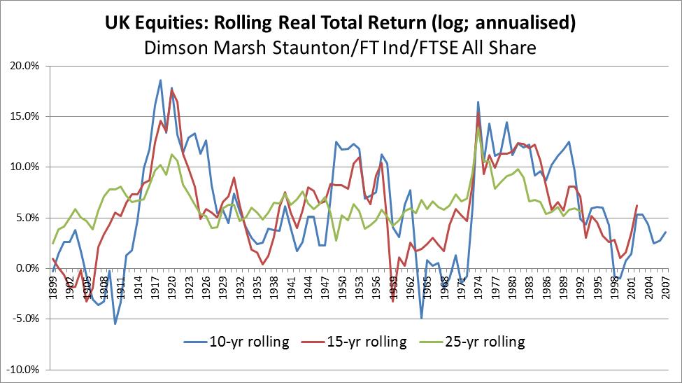
To keep the scale the same, these are all subsequent annualised rolling log returns, measured from the point plotted. What is clear is that the largest deviations still affect the 25-year returns but more cycles show up in the 10 and 15-year returns. The high returns ‘predicted’ by the very low share prices in my copy of the FT from January 1975 show as one of these extremes. Reversion to the mean occurred within each of the following 10, 15 and 25 years (so all the last plots available are close to 6%).
A global model of behaviour
The long-term trend (the regression trend fitted to the underlying time series) is 6.12% pa compared with 6.24% for the slightly longer US series. Other series are shorter and not necessarily as representative of the ‘true’ unknowable historical trend: Europe (ex UK) 6.61%, MSCI Australia 6.63% and Japan 4.80% (down from about 8% at one point – which shows the trend itself moves with any large changes in economic performance). A dollar-denominated index of returns from the MSCI Emerging Markets index deflated by US CPI is also about 6% pa. The data points to a ‘global’ model of investor behaviour that is remarkably little affected by cultural, economic or tax differences.
A further important insight is that when tracking any of these non-UK indices, currency exposure is to be embraced, not avoided. It is what turns the US engine for generating real returns for a US investor into an equivalent real-return engine for UK investors. After all, the mismatch between the US asset and the UK spending liability arises because US and UK inflation may be different. But if they are, currency movements should offset the difference, consistent with the theory of Purchasing Power Parity (PPP). This is also a theory that is supported by observed mean reversion. Changes in the ‘real’ exchange rate that are not explained by inflation differences represent an additional source of (uncorrelated) risk for the UK investor, but these can be allowed for in the sterling-adjusted future real return probabilities. It is interesting to note that the speed of mean reversion in exchange rates adjusted by inflation differences is quite similar to that in equity markets and the deviations from the mean are also similar in scale – although the mean itself (consistent with PPP) is near enough zero. This means that combining the two models, local-currency returns and real exchange rates, does not introduce conflicting dynamics.
What can you do with return projections derived from a return model? Not time markets, clearly, but you can do a lot that’s more productive in practice. For instance, if you can make the expected returns and associated uncertainty specific both to the starting level of the market and to the date in the future that you need to plan to, that is most valuable when you are managing to customised client objectives and quantified constraints, rather than to a general performance objective.
An example is managing private wealth subject to specified constraints at specified dates, such as when money will be consumed. Submitting to the discipline of horizon-specific outcome distributions, from say 1% certainty to 99% certainty, then has a real value as a risk control method. It allows you to answer question such as what is my probability of achieving higher lifetime income if I transfer out of my DB pension; or how much risk to take to avoid breaching a minimum spending target. It also allows you to measure the progress of a portfolio looking forwards, to target outcomes, rather than backwards at past performance or sideways at what other people are doing. This is what Fowler Drew does, using an entirely quantitative approach (so we’re not knocked off track by emotions) first developed in 1999 and now running live since 2004.
A practical implementation of our model is to measure the potential gain in welfare by transferring from a Defined Benefit pension. In this case, the model needs to calculate the chance of sustaining a draw from capital equal to the pension income being given up, with answers dependent on the risk approach. This could equally apply to a spending goal where the question is about the resources required to achieve spending targets; what spending will known resources sustain at different levels of confidence; or how much to draw as ‘income’ from a trust or endowment subject to a constraint of not depleting the real value of the capital at rolling horizons.
The usefulness of such an approach is not limited to linking the investment solution to goal-based planning. It also provides more composure, modifying the experience of living with risk, as clients testify. Some of that composure almost certainly comes from the simplicity and transparency – naivety, even – of the underlying premise, such as the fact that good and bad outcomes can be readily illustrated using exhibits for equity index histories such as these. Japan serves particularly well for this purpose: if what happened to returns for Japanese investors were to occur in all markets that would test the entire global market system almost to destruction. The question then is if it were as bad as that, is there any asset that would protect your wealth. Almost certainly not.