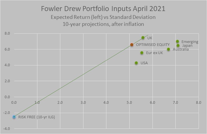
Let’s briefly go behind the scenes of the Fowler Drew portfolio-management model to see why we think equities are not generally overvalued. The key numbers are shown in the chart. This is familiar territory for investment professionals but private investors may welcome an explanation. We will post updates of this from time to time so followers of Fowler Drew will get familiar with it.
The trigger for this article is media coverage of opinions about equity markets that suggest they are overvalued and therefore vulnerable to a correction. These opinions are typically based on speculation about fundamental influences. That includes measures of market value that use fundamental inputs, such as price/earnings ratios. This allows commentators to write interesting narratives without being overly technical. The point about the Fowler Drew model is that it has interesting things to say precisely because it is objective and agnostic – a virtue that comes with it being more technical. Its messages are implicit in numbers generated by the model. That includes the numbers in the chart above.
The chart shows the classical risk and return trade off for equities, with annualised return on the y axis and risk on the x axis (running from left to right). In our version of risk/return space, both risk and return are in real terms, after inflation, and are specific to a defined holding period shown – in this case 10 years (longer than short term but not very long term). The red marker is the ‘optimal’ combination of the green markers, the green markers being our opportunity set for exposure to equity markets, all implementable using index funds. It is optimised on risk-adjusted return: as high and to the left within the chart area as market conditions allow.
Where are the bonds? Nowhere, except for the risk free return: the blue marker with a return of minus 2.5% and risk of zero. Because our clients are interested in real investment outcomes, the risk free rate has to be an Index Linked Gilt (ILG) yield. Risk is zero because we’re measuring the uncertainty associated with the holding-period return, rather than short-term price volatility. The green line connecting the risk free return and the mean expected risky-asset return is known in portfolio theory as the Capital Allocation Line. In the risk/return space shown in our chart, its slope or angle is a measure of the risk premium for equities, relative to a genuine risk free return.
These are the relevant data inputs to our portfolio-construction approach because we rely on ‘portfolio separation’ between risky and risk free assets, or hedges, to manage risk.
By way of explanation: portfolio separation contrasts with conventional ‘balanced management’ that relies on a combination of equities and bonds, and perhaps ‘alternative’ assets, to manage short-term portfolio volatility. All those investments have uncertain returns. The correlation between them, critical to the risk/return trade off, is also unknown. But it’s anyway the wrong trade off. Balanced management only works if investors are willing to ignore the more important measure of risk which is the chance of meeting a defined outcome with required confidence at known future dates, as represented by the investor’s liabilities. This is far more important than short-term price volatility, which is why most Defined Benefit pension schemes have replaced standardised balanced management with customised liability-driven investing.
For private clients with real outcomes as their liability, as spending is, the natural hedging asset is ILGs and portfolio separation requires only a horizon-matched ILG (or cash for near-term liabilities) and some optimal combination of equity market exposures. The mix of the two, equivalent to the total portfolio’s location on the Capital Allocation Line, is a function of individual risk aversion. We might add in passing that this is not only a more reliable means of risk management but also the cheapest, particularly when the intelligence driving it resides in a computer model.
The chart of our data inputs gives us answers to three different questions about equity valuation:
- How are different equity markets valued in terms of potential outcomes relative to the past?
- What’s the valuation of a portfolio that maximises risk-adjusted returns, subject to remaining diversified?
- What’s the valuation of that optimal portfolio relative to the risk free alternative?
1. Equity valuations in local currency
Answering the first question, the range of expected returns for the six markets and regions in our equity opportunity set is quite wide, with a gap between the UK and the US of 3.2% pa. Three areas are significantly below their historical return trend, the UK, Japan and Emerging Markets, with the US being above its. The absolute difference in projected mean return relative to their own return trend for each of these four is about 1.5% pa, significant but not extreme. We can note that Europe ex UK and Australia are both about 0.5% away from trend, so near enough normal. In terms of percentage deviations from trend, the US is about 30% above and the UK the same below. Market extremes, note, tend to be near twice that deviation. The word ‘bubble’ doesn’t really belong in our language but if it did it would surely apply to a historically extreme deviation above a hindsight-free trend.
Readers familiar with Fowler Drew will know that the historical trend for real returns matters for us because we model future return probabilities directly from the time series for each market’s total return (capital and income), deflated by its own inflation. We use as long a history as we can get, which ranges between 32 years and 150 years. The model assumes, as an agnostic default, that the observed whole-history trend will persist. That implies that ‘mean reversion’ also has to be allowed for, as long as actual cumulative returns are not in line with the trend. Thus high markets (as in levels of achieved real return well above the historical trend) are likely to be followed by low returns and low markets are associated with above-trend future returns.
2. The optimal portfolio in sterling terms
An expected return of 6.7% from an optimised mix of markets (the red marker) is nothing out of the ordinary. Most markets have a real return trend of about 6% pa. The overvaluation of US equities is not preventing us putting together a well-spread portfolio with historically competitive returns.
The country weights in the optimal portfolio also reflect expected currency returns and risk, relative to sterling, for the same holding period. This is also based on a mean-reverting model for real exchange rates, that is to say bilateral rates adjusted for differences in the two countries’ cumulative inflation. The model uses 50 years of data, from when exchange rates generally floated freely. Currently, sterling is modestly undervalued against all of the currencies in the opportunity set except the yen and it is only the sterling/yen rate that is significantly affecting the country weight. It boosts exposure to Japan which is anyway an undervalued market (22% below trend) but also one with above-average risk.
3. Equities relative to risk free rates
The valuation anomaly today is not equities but real risk free rates. Though we have selected a 10-year horizon, real risk free rates are at an unprecedented low level across the maturity spectrum. If equity valuations are fairly normal but the Capital Allocation Line shown in the chart is unusually steep, it has to be because risk free rates are lower than normal. In fact, the ex ante risk premium is as high as at past bear market lows, where equities were offering returns as high as 8-10%, based on their deviation from trend, but risk free rates were then at least 2%. I cannot emphasise enough how exceptional this is.
Surely we’ve had negative real yields in the past, you might ask. Only because nominal yields on conventional gilts turned out to have been exceeded by the rate of inflation. Markets’ past errors in forming inflation expectations simply remind us that nominal bonds, not indexed for inflation, are not risk free assets for investors who have real liabilities, as most private clients do.
The absolute value of equities is a matter of debate and our formal modelling approach is just one of many ways to value markets. Yet there is a general acknowledgement that equities, and other real assets like property, are much higher than they would have been without governments around the world pumping liquidity into financial markets. Initially a response to the credit crisis of 2008/9, further monetary easing was adopted as a response to the pandemic. It is perfectly possible that without that, markets would not have recovered so swiftly after the fall in early 2020 when the pandemic first took hold.
The approach to monetary policy since 2008 is clearly unorthodox. But that does not mean it is not sustainable. Rather, it has drawn attention to the fact that money in the modern economy is not necessarily better understood than it was in more primitive societies. Orthodoxy may be just another set of transient beliefs. This flux in knowledge has been seized on by proponents of Modern Monetary Theory, derided by its opponents as the Magic Money Tree. The key condition for the theory is that a nation be sovereign in terms of its own currency (Eurozone please note; Scotland please note.)
Monetary theory is an important debate for many aspects of politics as well as central banking. But it does not deny the power of markets to dictate to sovereigns, particularly when they are indebted to others, such as because of persistent trade deficits rather than domestic borrowing. The Fowler Drew model needs an assumption about future real yields for the purpose of simulating dynamic derisking as time horizons shorten. We assume that investors will not accept locking in negative real interest rates for long periods. In this respect, we treat markets, not central banks, as ultimately sovereign. The assumption of a positive ‘normal’ risk free rate (which we take to be 1%) implies losses will at some point be inflicted on bond holders, whether or not the bonds are nominal or indexed to inflation. For anyone for whom the bonds are risk assets, not perfect hedges, this will matter.
It is a moot point whether such losses will increase or reduce investor’s required real return from equities. Will they accept the restoration of a more normal risk premium? Or will they demand higher compensation, as they seem to have done since 2009? If in fact they still need extra encouragement to take risk, but this is no longer coming from very low interest rates, equities might for a period perform poorly, if not as poorly as bonds. But if investors feel desperate for a replacement for bonds, they may be happy to pay even higher prices for equities.
If that sounds a bit agnostic, so it should. That’s why the model needs the portfolio standard deviation of 5.1% pa as well as the mean expected return of 6.7%. And that’s at 10 years. For much shorter horizons the possible deviation, up or down, swamps the mean of the projections. What the historical data screams is that valuation means next to nothing as a short-term predictor of returns.